6 PANELS- I have used this template for the Digipak as I believe using the panels for pictures works well to sell the band to the audience and as this would be their debut album, this attention is necessary for sales.
FONT: The main font on the front cover is from a font website and I thought it worked well with the genre of the band and their type of music. I wanted a font that would stand out and that could possibly become a part of their bands image.
LAYOUT: I wanted to keep the layout of the font and pictures quite simple so that an audience can recognise their album straight away. As I wanted this album to stand out I made sure the main picture and the font work well together to achieve this. The rest of the pictures are different angles and shows different personalities they have such as the serious look in some of the photos to the back page photo where shows a fun, happy vibe.
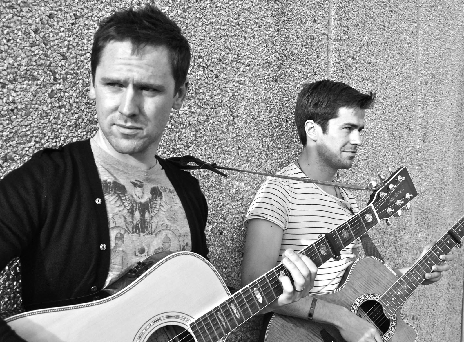
COLOUR: For the colour of the pictures I have opted to keep to black and white as I think works best not just for the quality of the images but this works with their genre and their whole look. One of the band members also prefers the use of black and white for the band and thinks it displays their genre well showing that I have used my own ideas but made sure the band is happy and comfortable with what I'm doing and how i'm displaying it.
Front Cover:
Back Page:
CD Tray:
Digipak Inserts:
For editing the photos from the band filming evening, I have used 'Windows Photo Gallery Editing Software' as this is the program I normally use for my photo editing and even though it is not as techinical as 'Photoshop' I know how to work this prgram and I know that good result can come from using this. I realise with some photos I will have to use more advanced software such as 'Photoshop' to improve the quality of the photos but for the initial editing I have opted for this software.
I wanted to make most of the pictures I took look more 'indie' in terms of style and set more of a mood so the black and white wash on most of these pictures were used for this reason. Ajusting the exposure and contrast makes the image stand out due to a better quality however it's the changes in tint and saturation that gives the black and white wash needed.

T
his is the album cover that I analysed for my magazine article too. This means that this image and font is used in their Digipak and Magazine article which is a possible option for myself. I like the colours used in the image and the image itself portrays the indie/rock genre.
This album cover is one of 'This Modern Life's main influences Bruce Springsteen. I have been looking at this image for inspriration as I would like to copy the colour use and the similar font use as I believe it would work for their album artwork also. This is very moody and atmospheric and the style I would like to use for both Magazine article and Digipak.
I have used this album artwork from One Night Only's album 'Started a Fire' as I like the contrast in the image and how it presents the band to be quite rocky. Even though this is in colour it is dark and is also atmospheric. This is something I want to portray when I am constructing both Digipak and Magazine article for 'This Modern Life'


 This is the album cover that I analysed for my magazine article too. This means that this image and font is used in their Digipak and Magazine article which is a possible option for myself. I like the colours used in the image and the image itself portrays the indie/rock genre.